Design Systems 101: Building Scalable UI Architecture (2025)
In the landscape of modern software development, consistency is the currency of scale. Mature technology companies like Shopify (Polaris), Atlassian, and Google (Material) do not rebuild buttons; they leverage a robust foundation.
A Design System is the single source of truth that dictates how a product looks, feels, and behaves. It is not merely a component library or a Figma file; it is the infrastructure that bridges the gap between design and engineering.
This comprehensive guide covers everything required to build, maintain, and scale a design system—from the foundational principles of Atomic Design to advanced implementation strategies using Design Tokens.
Introduction: The Problem Design Systems Solve
Before diving into the "what" and "how" of design systems, let's understand the "why." What problems are we trying to solve?
The Inconsistency Problem
Imagine a large e-commerce company with multiple product teams. Without a design system:
- The checkout team creates buttons with 8px border-radius
- The product catalog team uses 4px border-radius
- The account settings team decides on 12px
- Each team picks their own shade of "brand blue"
- Font sizes vary from 13px to 16px for body text
- Spacing follows different patterns everywhere
The result? A Frankenstein's monster of an interface where every page feels like a different website. Users lose trust. The brand appears unprofessional. Designers spend time reinventing the wheel instead of solving problems.
The Efficiency Problem
Without shared components, teams rebuild common patterns constantly:
- How many times has your organization implemented a dropdown menu?
- How many variations of a modal dialog exist in your codebase?
- How many developers have independently figured out form validation states?
This duplication wastes engineering time, introduces bugs, and makes the codebase harder to maintain.
The Communication Problem
Designers and developers speak different languages:
-
Designer: "Use our primary brand color with 80% opacity"
-
Developer: "What's the hex code? Is that #0066cc with 0.8 alpha? Or a different base color?"
-
Designer: "Add some comfortable spacing around this"
-
Developer: "Is that 16px? 24px? 32px?"
Without shared vocabulary and defined values, every handoff becomes a negotiation.
The Scale Problem
As organizations grow:
- New designers can't know institutional knowledge
- New developers can't find existing components
- Teams working in isolation create conflicting solutions
- Mobile, web, and desktop apps diverge visually
- Global teams interpret guidelines differently
A design system addresses all of these problems by creating a shared foundation.
Part 1: The Language of Design Systems (Design Tokens)
Design Tokens are the atoms of design—the smallest, most fundamental decisions.
Instead of hardcoding #3b82f6 in 50 CSS files, you define:
color.primary.500 = #3b82f6spacing.md = 16pxshadow.lg = 0 10px 15px -3px rgba(0,0,0,0.1)
Tokens are platform-agnostic. You define them once, and tools export them for every platform.
Types of Design Tokens
Color Tokens
{
  "color": {
    "primitive": {
      "blue": {
        "50": { "value": "#eff6ff" },
        "100": { "value": "#dbeafe" },
        "500": { "value": "#3b82f6" },
        "900": { "value": "#1e3a8a" }
      }
    },
    "semantic": {
      "primary": { "value": "{color.primitive.blue.500}" },
      "background": {
        "default": { "value": "#ffffff" },
        "subtle": { "value": "{color.primitive.blue.50}" }
      },
      "text": {
        "default": { "value": "#1f2937" },
        "muted": { "value": "#6b7280" },
        "inverse": { "value": "#ffffff" }
      },
      "border": {
        "default": { "value": "#e5e7eb" },
        "focus": { "value": "{color.primitive.blue.500}" }
      }
    }
  }
}
Primitive tokens are raw values—your color palette. Semantic tokens reference primitives and convey meaning—"primary" instead of "blue-500."
This indirection is powerful. If your brand changes from blue to purple, you change one line:
"primary": { "value": "{color.primitive.purple.500}" }
Every component using primary updates automatically.
Spacing Tokens
{
  "spacing": {
    "0": { "value": "0" },
    "1": { "value": "4px" },
    "2": { "value": "8px" },
    "3": { "value": "12px" },
    "4": { "value": "16px" },
    "6": { "value": "24px" },
    "8": { "value": "32px" },
    "12": { "value": "48px" },
    "16": { "value": "64px" }
  }
}
A consistent spacing scale creates visual rhythm. The 4-point grid (multiples of 4px) is popular because it works well on various screen densities.
Typography Tokens
{
  "font": {
    "family": {
      "sans": {
        "value": "'Inter', -apple-system, BlinkMacSystemFont, sans-serif"
      },
      "mono": { "value": "'Fira Code', Consolas, monospace" }
    },
    "size": {
      "xs": { "value": "12px" },
      "sm": { "value": "14px" },
      "base": { "value": "16px" },
      "lg": { "value": "18px" },
      "xl": { "value": "20px" },
      "2xl": { "value": "24px" },
      "3xl": { "value": "30px" },
      "4xl": { "value": "36px" }
    },
    "weight": {
      "normal": { "value": "400" },
      "medium": { "value": "500" },
      "semibold": { "value": "600" },
      "bold": { "value": "700" }
    },
    "lineHeight": {
      "tight": { "value": "1.25" },
      "normal": { "value": "1.5" },
      "relaxed": { "value": "1.75" }
    }
  },
  "typography": {
    "heading1": {
      "fontFamily": { "value": "{font.family.sans}" },
      "fontSize": { "value": "{font.size.4xl}" },
      "fontWeight": { "value": "{font.weight.bold}" },
      "lineHeight": { "value": "{font.lineHeight.tight}" }
    },
    "body": {
      "fontFamily": { "value": "{font.family.sans}" },
      "fontSize": { "value": "{font.size.base}" },
      "fontWeight": { "value": "{font.weight.normal}" },
      "lineHeight": { "value": "{font.lineHeight.normal}" }
    }
  }
}
Shadow Tokens
{
  "shadow": {
    "sm": { "value": "0 1px 2px 0 rgba(0, 0, 0, 0.05)" },
    "md": {
      "value": "0 4px 6px -1px rgba(0, 0, 0, 0.1), 0 2px 4px -1px rgba(0, 0, 0, 0.06)"
    },
    "lg": {
      "value": "0 10px 15px -3px rgba(0, 0, 0, 0.1), 0 4px 6px -2px rgba(0, 0, 0, 0.05)"
    },
    "xl": {
      "value": "0 20px 25px -5px rgba(0, 0, 0, 0.1), 0 10px 10px -5px rgba(0, 0, 0, 0.04)"
    }
  }
}
Border Radius Tokens
{
  "borderRadius": {
    "none": { "value": "0" },
    "sm": { "value": "2px" },
    "md": { "value": "4px" },
    "lg": { "value": "8px" },
    "xl": { "value": "12px" },
    "2xl": { "value": "16px" },
    "full": { "value": "9999px" }
  }
}
Design Token Tools
Style Dictionary (by Amazon)
Style Dictionary is the industry standard for transforming design tokens into platform-specific code.
Installation:
npm install style-dictionary
Configuration:
// config.js
module.exports = {
  source: ["tokens/**/*.json"],
  platforms: {
    css: {
      transformGroup: "css",
      buildPath: "build/css/",
      files: [
        {
          destination: "variables.css",
          format: "css/variables",
        },
      ],
    },
    scss: {
      transformGroup: "scss",
      buildPath: "build/scss/",
      files: [
        {
          destination: "_variables.scss",
          format: "scss/variables",
        },
      ],
    },
    js: {
      transformGroup: "js",
      buildPath: "build/js/",
      files: [
        {
          destination: "tokens.js",
          format: "javascript/es6",
        },
      ],
    },
    ios: {
      transformGroup: "ios",
      buildPath: "build/ios/",
      files: [
        {
          destination: "StyleDictionary.h",
          format: "ios/macros",
        },
      ],
    },
    android: {
      transformGroup: "android",
      buildPath: "build/android/",
      files: [
        {
          destination: "colors.xml",
          format: "android/colors",
        },
      ],
    },
  },
};
Output Examples:
CSS:
:root {
  --color-primary-500: #3b82f6;
  --spacing-4: 16px;
  --font-size-base: 16px;
}
iOS (Swift):
extension UIColor {
    static let colorPrimary500 = UIColor(red: 0.231, green: 0.510, blue: 0.965, alpha: 1.0)
}
Android (XML):
<color name="color_primary_500">#3b82f6</color>
This is the key to Cross-Platform Consistency. Define once, use everywhere.
Part 2: The Structure of Design Systems (Atomic Design)
Brad Frost's Atomic Design is the industry mental model for organizing components.
The metaphor comes from chemistry: just as matter is composed of atoms that combine into molecules and organisms, interfaces are composed of small elements that combine into larger patterns.
Level 1: Atoms
The smallest UI elements that can't be broken down further without losing meaning.
Examples:
- Buttons
- Input fields
- Labels
- Icons
- Checkboxes
- Radio buttons
// atoms/Button.tsx
interface ButtonProps {
  variant: "primary" | "secondary" | "danger";
  size: "sm" | "md" | "lg";
  disabled?: boolean;
  children: React.ReactNode;
  onClick?: () => void;
}

export function Button({
  variant = "primary",
  size = "md",
  disabled = false,
  children,
  onClick,
}: ButtonProps) {
  return (
    <button
      className={`btn btn-${variant} btn-${size}`}
      disabled={disabled}
      onClick={onClick}
    >
      {children}
    </button>
  );
}
Atoms consume design tokens directly. They don't have business logic—they're pure presentation.
Level 2: Molecules
Grouped atoms that form simple, functional units.
Examples:
- Search bar (input + button)
- Form field (label + input + error message)
- Card header (avatar + name + timestamp)
- Navigation item (icon + text)
// molecules/SearchBar.tsx
interface SearchBarProps {
  placeholder?: string;
  onSearch: (query: string) => void;
}

export function SearchBar({
  placeholder = "Search...",
  onSearch,
}: SearchBarProps) {
  const [query, setQuery] = useState("");

  const handleSubmit = (e: FormEvent) => {
    e.preventDefault();
    onSearch(query);
  };

  return (
    <form onSubmit={handleSubmit} className="search-bar">
      <Input
        type="search"
        value={query}
        onChange={(e) => setQuery(e.target.value)}
        placeholder={placeholder}
      />
      <Button type="submit" variant="primary">
        <Icon name="search" />
      </Button>
    </form>
  );
}
Level 3: Organisms
Complex, distinct sections composed of molecules and atoms.
Examples:
- Navigation header
- Product card
- User profile card
- Comment thread
- Data table
// organisms/ProductCard.tsx
interface ProductCardProps {
  product: {
    id: string;
    name: string;
    price: number;
    image: string;
    rating: number;
    inStock: boolean;
  };
  onAddToCart: (productId: string) => void;
}

export function ProductCard({ product, onAddToCart }: ProductCardProps) {
  return (
    <Card>
      <CardImage src={product.image} alt={product.name} />
      <CardBody>
        <CardTitle>{product.name}</CardTitle>
        <Rating value={product.rating} />
        <Price amount={product.price} />
      </CardBody>
      <CardFooter>
        <Button
          variant="primary"
          disabled={!product.inStock}
          onClick={() => onAddToCart(product.id)}
        >
          {product.inStock ? "Add to Cart" : "Out of Stock"}
        </Button>
      </CardFooter>
    </Card>
  );
}
Level 4: Templates
Page layouts without real content—the structural skeleton.
// templates/ProductListingTemplate.tsx
interface ProductListingTemplateProps {
  header: React.ReactNode;
  sidebar: React.ReactNode;
  products: React.ReactNode;
  pagination: React.ReactNode;
}

export function ProductListingTemplate({
  header,
  sidebar,
  products,
  pagination,
}: ProductListingTemplateProps) {
  return (
    <div className="layout">
      <header className="layout-header">{header}</header>
      <div className="layout-body">
        <aside className="layout-sidebar">{sidebar}</aside>
        <main className="layout-main">
          <div className="product-grid">{products}</div>
          {pagination}
        </main>
      </div>
    </div>
  );
}
Level 5: Pages
Templates filled with real content and connected to data sources.
// pages/ProductListing.tsx
export function ProductListingPage() {
  const { products, isLoading } = useProducts();
  const { filters, setFilters } = useFilters();
  const { page, setPage, totalPages } = usePagination();

  return (
    <ProductListingTemplate
      header={<NavigationHeader />}
      sidebar={<FilterPanel filters={filters} onChange={setFilters} />}
      products={
        isLoading ? (
          <ProductGridSkeleton />
        ) : (
          products.map((product) => (
            <ProductCard
              key={product.id}
              product={product}
              onAddToCart={handleAddToCart}
            />
          ))
        )
      }
      pagination={
        <Pagination current={page} total={totalPages} onChange={setPage} />
      }
    />
  );
}
The Benefits of Atomic Design
- Clear separation of concerns: Each level has a defined responsibility
- Reusability: Atoms and molecules are highly reusable
- Testability: Small units are easier to test in isolation
- Maintainability: Changes propagate predictably
- Consistency: Composition ensures consistent patterns
Part 3: The Tooling Ecosystem
A design system lives across multiple tools and platforms. Here's the essential stack.
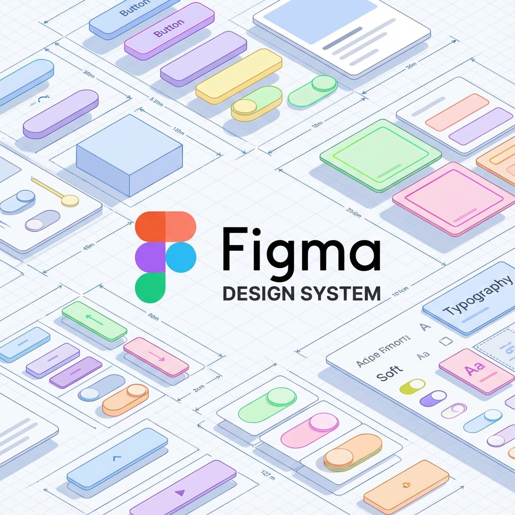
Figma: The Design Side
Figma has become the industry standard for design system management in the design world.
Component Architecture in Figma
Figma components mirror code components:
- Base components: The atoms
- Component sets: Variants (like button variants)
- Auto-layout: Flexbox-like layouts
- Constraints: Responsive behavior
Figma Tokens Plugin
The key feature is Figma Tokens Plugin. It syncs your JSON token file with Figma, so designers and developers use the same values.
Workflow:
- Define tokens in JSON (the source of truth)
- Figma Tokens plugin reads the JSON
- Designers use tokens in Figma (not raw hex codes)
- Changes to tokens propagate everywhere
Component Documentation
Document components directly in Figma:
- Usage guidelines
- Do's and don'ts
- Accessibility notes
- Related components
Storybook: The Development Side
Storybook is the isolated sandbox where you render every variant of every component.
Setup:
npx storybook@latest init
Story Example:
// Button.stories.tsx
import type { Meta, StoryObj } from "@storybook/react";
import { Button } from "./Button";

const meta: Meta<typeof Button> = {
  title: "Components/Button",
  component: Button,
  tags: ["autodocs"],
  argTypes: {
    variant: {
      control: "select",
      options: ["primary", "secondary", "danger"],
    },
    size: {
      control: "select",
      options: ["sm", "md", "lg"],
    },
  },
};

export default meta;
type Story = StoryObj<typeof Button>;

export const Primary: Story = {
  args: {
    variant: "primary",
    children: "Primary Button",
  },
};

export const Secondary: Story = {
  args: {
    variant: "secondary",
    children: "Secondary Button",
  },
};

export const Disabled: Story = {
  args: {
    variant: "primary",
    children: "Disabled Button",
    disabled: true,
  },
};

export const AllSizes: Story = {
  render: () => (
    <div style={{ display: "flex", gap: "16px", alignItems: "center" }}>
      <Button size="sm">Small</Button>
      <Button size="md">Medium</Button>
      <Button size="lg">Large</Button>
    </div>
  ),
};
Storybook Addons
Essential addons for design systems:
- Docs: Auto-generated documentation
- Controls: Interactive props panel
- Actions: Log callbacks
- Viewport: Test responsive behavior
- A11y: Automated accessibility checks
- Design: Embed Figma designs
Visual Regression Testing: Chromatic
How do you catch visual regressions?
Chromatic (by the Storybook team) takes screenshots of every story. When you push a PR, it compares screenshots. If a pixel changed unexpectedly, it flags it for review.
Setup:
npm install --save-dev chromatic
npx chromatic --project-token=YOUR_TOKEN
CI Integration (GitHub Actions):
name: Chromatic
on: push

jobs:
  chromatic:
    runs-on: ubuntu-latest
    steps:
      - uses: actions/checkout@v3
        with:
          fetch-depth: 0
      - uses: actions/setup-node@v3
      - run: npm ci
      - uses: chromaui/action@v1
        with:
          projectToken: ${{ secrets.CHROMATIC_PROJECT_TOKEN }}
Documentation Sites
Design systems need documentation beyond Storybook:
- Getting started guides
- Design principles
- Voice and tone guidelines
- Contribution guidelines
Options:
- ZeroHeight: Purpose-built for design systems
- Notion: Flexible, collaborative
- Docusaurus: Developer-focused
- Custom Next.js site: Full control
Part 4: Component Design Principles
Building great components requires thoughtful API design.
Composition Over Configuration
Bad: Configuration explosion
<Button
  leftIcon={<Icon name="plus" />}
  rightIcon={<Icon name="arrow" />}
  iconPosition="left"
  iconSpacing="8px"
>
  Add Item
</Button>
Good: Composition
<Button>
  <Icon name="plus" />
  Add Item
  <Icon name="arrow" />
</Button>
Controlled vs. Uncontrolled
Support both patterns:
interface InputProps {
  // Controlled
  value?: string;
  onChange?: (value: string) => void;
  // Uncontrolled
  defaultValue?: string;
}

function Input({ value, onChange, defaultValue }: InputProps) {
  const [internalValue, setInternalValue] = useState(defaultValue ?? "");

  const isControlled = value !== undefined;
  const currentValue = isControlled ? value : internalValue;

  const handleChange = (e: ChangeEvent<HTMLInputElement>) => {
    const newValue = e.target.value;
    if (!isControlled) {
      setInternalValue(newValue);
    }
    onChange?.(newValue);
  };

  return <input value={currentValue} onChange={handleChange} />;
}
Polymorphic Components
Allow components to render as different elements:
type ButtonProps<C extends ElementType> = {
  as?: C;
  children: ReactNode;
  variant?: 'primary' | 'secondary';
} & ComponentPropsWithoutRef<C>;

function Button<C extends ElementType = 'button'>({
  as,
  children,
  variant = 'primary',
  ...props
}: ButtonProps<C>) {
  const Component = as || 'button';

  return (
    <Component className={`btn btn-${variant}`} {...props}>
      {children}
    </Component>
  );
}

// Usage
<Button>Regular Button</Button>
<Button as="a" href="/about">Link Button</Button>
<Button as={Link} to="/about">React Router Link</Button>
Forwarding Refs
Components should forward refs for DOM access:
const Button = forwardRef<HTMLButtonElement, ButtonProps>(function Button(
  { children, variant = "primary" },
  ref
) {
  return (
    <button ref={ref} className={`btn btn-${variant}`}>
      {children}
    </button>
  );
});

// Usage
const buttonRef = useRef<HTMLButtonElement>(null);
<Button ref={buttonRef}>Click me</Button>;
Spreading Props
Allow consumers to pass additional props:
interface CardProps extends React.HTMLAttributes<HTMLDivElement> {
  variant?: "default" | "outlined";
  children: React.ReactNode;
}

function Card({
  variant = "default",
  children,
  className,
  ...props
}: CardProps) {
  return (
    <div className={clsx("card", `card-${variant}`, className)} {...props}>
      {children}
    </div>
  );
}
Part 5: The Hard Part (Adoption)
A Design System is useless if no one uses it.
The Adoption Challenge
The Product team will always ask: "Can we make this button red just for this campaign?"
The answer should be: "We can add a variant: 'danger' to the Button component."
This keeps the system intact while accommodating new use cases.
Strategies for Adoption
1. Start with Pain Points
Don't try to systematize everything at once. Start with:
- The most commonly rebuilt components
- The biggest sources of inconsistency
- Components causing the most bugs
2. Make It Easy
If using the design system is harder than not using it, people won't use it.
- Installation: One package, simple install
- Documentation: Clear, searchable, with examples
- Tooling: IDE autocompletion, TypeScript types
- Templates: Starter projects, code snippets
3. Create Champions
Identify advocates in each team:
- Train them deeply
- Involve them in decisions
- Let them spread knowledge organically
4. Measure Adoption
Track metrics:
- Component usage analytics
- Imports from the design system package
- Custom component creation (should decrease)
- Time to build new features (should decrease)
5. Communicate Value
Show stakeholders:
- Time saved (quantified)
- Bug reduction
- Improved consistency (visual examples)
- Faster onboarding
Handling Exceptions
Not everything fits neatly into a design system. Handle edge cases with:
Escape Hatches
// Allow custom styling when truly needed
<Button
  variant="primary"
  className="campaign-special-button" // Escape hatch
>
  Special Offer
</Button>
Contribution Process
Make it easy to propose additions:
- Open an issue with the use case
- Design system team reviews
- If approved, collaborate on implementation
- Document and release
Part 6: Versioning and Distribution
How do you ship and version your design system?
Package Structure
Monorepo Approach (Recommended):
design-system/
├── packages/
│   ├── tokens/           # Design tokens
│   ├── core/             # Core components
│   ├── icons/            # Icon library
│   ├── charts/           # Data visualization
│   └── themes/           # Theme variations
├── apps/
│   ├── docs/             # Documentation site
│   └── storybook/        # Storybook
└── tools/
    └── eslint-plugin/    # Custom lint rules
Publishing:
// packages/core/package.json
{
  "name": "@mycompany/design-system",
  "version": "2.1.0",
  "main": "dist/index.js",
  "module": "dist/index.esm.js",
  "types": "dist/index.d.ts",
  "sideEffects": ["*.css"],
  "peerDependencies": {
    "react": ">=18.0.0",
    "react-dom": ">=18.0.0"
  }
}
Semantic Versioning
Follow semantic versioning strictly:
- Major (2.0.0): Breaking changes (API changes, removal of components)
- Minor (2.1.0): New features (new components, new variants)
- Patch (2.1.1): Bug fixes (no API changes)
Changelog
Maintain a detailed changelog:
# Changelog

## [2.1.0] - 2024-09-08

### Added

- New `Skeleton` component for loading states
- `danger` variant for `Badge` component
- Support for ref forwarding in all form components

### Changed

- Improved keyboard navigation in `Select` component
- Updated color tokens for better accessibility

### Fixed

- Fixed focus ring visibility in high contrast mode
- Resolved z-index conflict in `Dropdown` component
Deprecation Strategy
When deprecating:
- Announce in advance: Give teams time to migrate
- Add deprecation warnings: Console warnings in development
- Provide migration path: Clear documentation on alternatives
- Gradual removal: deprecate → warning → error → remove
// Deprecated component with warning
function OldButton(props: OldButtonProps) {
  useEffect(() => {
    if (process.env.NODE_ENV === "development") {
      console.warn(
        "OldButton is deprecated and will be removed in v3.0. " +
          "Please migrate to Button. See migration guide: [URL]"
      );
    }
  }, []);

  return <Button {...props} />;
}
Part 7: Theming
Many design systems need to support multiple themes.
CSS Custom Properties (Variables)
:root {
  /* Light theme (default) */
  --color-background: #ffffff;
  --color-text: #1f2937;
  --color-primary: #3b82f6;
}

[data-theme="dark"] {
  --color-background: #111827;
  --color-text: #f9fafb;
  --color-primary: #60a5fa;
}
Theme Provider Pattern
// ThemeProvider.tsx
interface Theme {
  colors: {
    background: string;
    text: string;
    primary: string;
  };
}

const lightTheme: Theme = {
  /* ... */
};
const darkTheme: Theme = {
  /* ... */
};

const ThemeContext = createContext<{
  theme: Theme;
  toggleTheme: () => void;
}>({ theme: lightTheme, toggleTheme: () => {} });

export function ThemeProvider({ children }: { children: ReactNode }) {
  const [theme, setTheme] = useState<Theme>(lightTheme);

  const toggleTheme = () => {
    setTheme((current) => (current === lightTheme ? darkTheme : lightTheme));
  };

  useEffect(() => {
    // Apply CSS variables
    Object.entries(theme.colors).forEach(([key, value]) => {
      document.documentElement.style.setProperty(`--color-${key}`, value);
    });
  }, [theme]);

  return (
    <ThemeContext.Provider value={{ theme, toggleTheme }}>
      {children}
    </ThemeContext.Provider>
  );
}

export const useTheme = () => useContext(ThemeContext);
Multi-Brand Theming
For companies with multiple brands:
/* Base component styles */
.button {
  padding: var(--button-padding);
  border-radius: var(--button-radius);
  font-weight: var(--button-font-weight);
}

/* Brand A */
[data-brand="brand-a"] {
  --button-padding: 12px 24px;
  --button-radius: 8px;
  --button-font-weight: 600;
}

/* Brand B (more conservative) */
[data-brand="brand-b"] {
  --button-padding: 10px 20px;
  --button-radius: 4px;
  --button-font-weight: 500;
}
Part 8: Testing Your Design System
Design systems require comprehensive testing.
Unit Tests
Test component behavior:
// Button.test.tsx
import { render, screen, fireEvent } from "@testing-library/react";
import { Button } from "./Button";

describe("Button", () => {
  it("renders children correctly", () => {
    render(<Button>Click me</Button>);
    expect(screen.getByRole("button")).toHaveTextContent("Click me");
  });

  it("calls onClick when clicked", () => {
    const handleClick = jest.fn();
    render(<Button onClick={handleClick}>Click me</Button>);
    fireEvent.click(screen.getByRole("button"));
    expect(handleClick).toHaveBeenCalledTimes(1);
  });

  it("is disabled when disabled prop is true", () => {
    render(<Button disabled>Click me</Button>);
    expect(screen.getByRole("button")).toBeDisabled();
  });

  it("applies variant classes correctly", () => {
    render(<Button variant="danger">Delete</Button>);
    expect(screen.getByRole("button")).toHaveClass("btn-danger");
  });
});
Accessibility Tests
import { axe, toHaveNoViolations } from "jest-axe";

expect.extend(toHaveNoViolations);

describe("Button accessibility", () => {
  it("has no accessibility violations", async () => {
    const { container } = render(<Button>Click me</Button>);
    const results = await axe(container);
    expect(results).toHaveNoViolations();
  });

  it("has no accessibility violations when disabled", async () => {
    const { container } = render(<Button disabled>Click me</Button>);
    const results = await axe(container);
    expect(results).toHaveNoViolations();
  });
});
Visual Regression Tests
With Chromatic or Percy:
// Button.stories.tsx
export const AllVariants: Story = {
  render: () => (
    <div style={{ display: "grid", gap: "16px" }}>
      <Button variant="primary">Primary</Button>
      <Button variant="secondary">Secondary</Button>
      <Button variant="danger">Danger</Button>
      <Button disabled>Disabled</Button>
    </div>
  ),
};
Integration Tests
Test components working together:
describe("Form integration", () => {
  it("submits form data correctly", async () => {
    const handleSubmit = jest.fn();

    render(
      <Form onSubmit={handleSubmit}>
        <TextField name="email" label="Email" />
        <TextField name="password" label="Password" type="password" />
        <Button type="submit">Submit</Button>
      </Form>
    );

    await userEvent.type(screen.getByLabelText("Email"), "[email protected]");
    await userEvent.type(screen.getByLabelText("Password"), "password123");
    await userEvent.click(screen.getByRole("button", { name: "Submit" }));

    expect(handleSubmit).toHaveBeenCalledWith({
      email: "[email protected]",
      password: "password123",
    });
  });
});
Part 9: Governance and Process
A design system needs governance to stay healthy.
Team Structure
Dedicated Team Model:
- Full-time design system team
- Owns development, documentation, support
- Works with product teams as consultants
Federated Model:
- Representatives from each product team
- Part-time contribution
- Shared ownership
Hybrid Model (Recommended):
- Core team handles infrastructure, tokens, critical components
- Product teams contribute specialized components
- Clear contribution guidelines
Contribution Workflow
1. Proposal
   └── Issue template with use case, API proposal

2. Review
   └── Design system team evaluates fit, scope

3. Design
   └── Collaborate on API, accessibility, variants

4. Implementation
   └── Code review, documentation, tests

5. Release
   └── Changelog, announcement, migration guides
Decision Records
Document significant decisions:
# ADR-001: Button Component API

## Status

Accepted

## Context

We need a button component that supports multiple variants, sizes, and states.

## Decision

We will use a composition-based API rather than configuration-based.

## Consequences

- Pros: More flexible, easier to extend
- Cons: Slightly more verbose for simple cases
Conclusion
A Design System is an investment. For a 3-person startup, it is overkill. For a 30-person company with multiple apps, it prevents chaos. Start with Tokens. Add components. Document everything.
Key Takeaways
- Design tokens are foundational: Start here before building components
- Atomic design provides structure: Organize from atoms to pages
- Tooling enables scale: Invest in Figma, Storybook, and testing
- Adoption requires effort: Make it easy and communicate value
- Governance keeps it healthy: Processes for contribution and maintenance
Getting Started Checklist
- Define core design tokens (colors, spacing, typography)
- Set up Style Dictionary for token transformation
- Build 5-10 core atoms (Button, Input, Icon, etc.)
- Set up Storybook with documentation
- Create a few molecules and organisms
- Write component documentation
- Set up CI/CD and visual regression testing
- Publish first version to package registry
- Create getting started guide
- Present to organization and gather feedback
The journey to a mature design system takes time—often years. But every step toward consistency, efficiency, and quality is worth the investment.
Additional Resources
- Atomic Design by Brad Frost: https://atomicdesign.bradfrost.com/
- Style Dictionary: https://amzn.github.io/style-dictionary/
- Storybook: https://storybook.js.org/
- Design Tokens Community Group: https://www.w3.org/community/design-tokens/
- Component Gallery: https://component.gallery/
Appendix: Design System Examples
Corporate Design Systems
- Google Material: https://material.io/
- IBM Carbon: https://carbondesignsystem.com/
- Salesforce Lightning: https://www.lightningdesignsystem.com/
- Microsoft Fluent: https://fluent2.microsoft.design/
Open Source Systems
- Radix UI: https://www.radix-ui.com/
- Chakra UI: https://chakra-ui.com/
- shadcn/ui: https://ui.shadcn.com/
Each represents different philosophies and trade-offs worth studying.