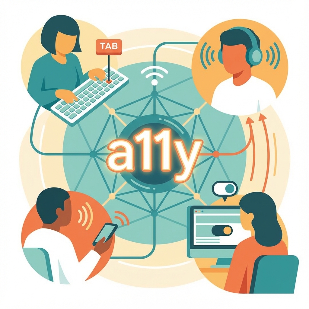
Web Accessibility (A11y) Masterclass: Building for Every User
The web was designed to be universal. As Tim Berners-Lee famously stated, "The power of the Web is in its universality. Access by everyone regardless of disability is an essential aspect."
Yet, 96% of the top 1 million homepages fail basic WCAG 2 checks. As developers, we are the gatekeepers who decide who gets to participate in the digital economy.
In this masterclass, we move beyond "Add alt text" and dive into the mechanics of the Accessibility Tree, Focus Management, and ARIA to build truly inclusive interfaces.
Introduction: Why Accessibility Matters
Accessibility—often abbreviated as "a11y" (the 11 represents the eleven letters between 'a' and 'y')—is the practice of designing and developing digital products that can be used by people with disabilities. But this definition, while technically accurate, undersells both the scope and importance of accessible design.
The Scale of the Issue
According to the World Health Organization, over 1 billion people—approximately 15% of the global population—live with some form of disability. In the United States alone, the CDC reports that 26% of adults have some type of disability. These numbers only account for permanent disabilities; situational and temporary disabilities affect virtually everyone at some point.
Consider:
- Permanent disabilities: Blindness, deafness, motor impairments, cognitive differences
- Temporary disabilities: Broken arm in a cast, ear infection, concussion
- Situational disabilities: Holding a baby while trying to use a phone, bright sunlight washing out a screen, loud environment making audio impossible to hear
When we design for accessibility, we design for all of these scenarios. The curb-cut effect demonstrates this perfectly: sidewalk ramps were originally designed for wheelchair users, but they benefit parents with strollers, delivery workers with dollies, travelers with luggage wheels, and anyone who finds stairs inconvenient.
The Legal Landscape
Accessibility isn't just ethically important—it's increasingly legally mandated:
In the United States:
- The Americans with Disabilities Act (ADA) has been interpreted by courts to apply to websites
- Section 508 requires federal agencies to make their electronic information accessible
- Lawsuits related to web accessibility have increased dramatically, from about 2,000 in 2017 to over 10,000 annually by 2023
Internationally:
- The European Accessibility Act requires accessible products and services
- The UK Equality Act includes provisions for digital accessibility
- Canada's Accessible Canada Act sets federal accessibility requirements
- Many countries reference WCAG in their legislation
The legal risk is real. Major companies including Domino's Pizza, Beyoncé (her website), and Netflix have faced accessibility lawsuits. Remediation after a lawsuit is far more expensive than building accessibly from the start.
The Business Case
Beyond legal requirements, accessibility makes business sense:
- Expanded market: 1 billion potential customers with disabilities globally
- SEO benefits: Accessibility practices (semantic HTML, alt text, clear structure) improve search rankings
- Better UX for everyone: Accessible interfaces are clearer, more usable interfaces
- Brand reputation: Accessibility signals corporate responsibility
- Innovation driver: Solving accessibility challenges often leads to innovations that benefit everyone (voice interfaces, for example)
Part 1: The Accessibility Tree
Before diving into techniques, we need to understand how assistive technologies interact with web pages.
The DOM vs. The Accessibility Tree
The browser parses HTML into the DOM (Document Object Model)—a tree structure representing every element on the page. You're familiar with this tree; you see it in your browser's DevTools.
In parallel, the browser builds the AOM (Accessibility Object Model) or Accessibility Tree. This is a separate tree structure specifically designed for assistive technologies like screen readers.
The Accessibility Tree is a simplified, semantically meaningful representation of the page:
<!-- DOM Structure -->
<div class="header">
  <div class="nav">
    <div class="link" onclick="goHome()">Home</div>
  </div>
</div>

<!-- What the Accessibility Tree sees: Not much! -->
<!-- These divs have no semantic meaning -->
Compare with:
<!-- DOM Structure -->
<header>
  <nav>
    <a href="/">Home</a>
  </nav>
</header>

<!-- What the Accessibility Tree sees: -->
<!-- banner (header) -->
<!--   navigation (nav) -->
<!--     link "Home" (a) -->
The second example provides rich semantic information:
- The
<header>becomes a "banner" landmark - The
<nav>becomes a "navigation" landmark - The
<a>becomes a focusable link with a name
What Goes Into the Accessibility Tree?
Each node in the Accessibility Tree has properties:
- Role: What type of element is this? (button, link, heading, etc.)
- Name: What is this element called? (button text, image alt text, label text)
- State: What is the current state? (checked, expanded, disabled, etc.)
- Value: For inputs, what is the current value?
- Description: Additional descriptive text
Viewing the Accessibility Tree
In Chrome DevTools:
- Open DevTools (F12)
- Go to the Elements panel
- Look for the Accessibility pane (you may need to click the ">>" button to find it)
- Select an element to see its accessibility properties
In Firefox:
- Open DevTools
- Go to the Accessibility tab
- Browse the tree structure
This is an invaluable debugging tool. If an element doesn't appear in the Accessibility Tree as expected, screen reader users won't be able to interact with it properly.
Rule #1: Use Semantic HTML
This is the foundation of accessibility:
<!-- BAD: A div pretending to be a button -->
<div class="button" onclick="submit()">Submit</div>
<!-- Accessibility Tree: Nothing! No role, no focusability -->

<!-- GOOD: An actual button -->
<button onclick="submit()">Submit</button>
<!-- Accessibility Tree: button "Submit" -->
If you use <div onClick={submit}>Submit</div>, the Accessibility Tree sees nothing. The screen reader user doesn't know it's clickable. They can't focus it with Tab. They can't activate it with Enter.
If you use <button>, you get focus, keyboard support (Enter/Space activation), and semantics for free. No extra work required.
Common Semantic HTML Elements
| Element | Purpose | Accessibility Role |
|---|---|---|
<header> | Page or section header | banner |
<nav> | Navigation | navigation |
<main> | Main content | main |
<article> | Self-contained content | article |
<aside> | Tangential content | complementary |
<footer> | Footer | contentinfo |
<button> | Interactive control | button |
<a href> | Links to other pages | link |
<h1>-<h6> | Headings | heading (level 1-6) |
<ul>, <ol> | Lists | list |
<li> | List items | listitem |
<table> | Tabular data | table |
<form> | Form container | form |
<label> | Form labels | label |
<input> | Form inputs | textbox, checkbox, etc. |
Part 2: Focus Management
For mouse users, focus doesn't matter—they click where they want. For keyboard users, Focus is everything. It is their cursor.
The Focus Order
By default, focus follows DOM order. Pressing Tab moves focus to the next focusable element; Shift+Tab moves backward.
Focusable Elements
By default, these elements are focusable:
- Links (
<a href>) - Buttons (
<button>) - Form inputs (
<input>,<select>,<textarea>) - Elements with
tabindex="0"
These are NOT focusable by default:
- Divs, spans, sections
- Images
- Paragraphs
- Headings
The Tab Order Should Follow the Visual Order
This seems obvious, but CSS can break it. If you use float: right or flex-direction: row-reverse or order properties, the visual order might differ from the DOM order. This is a WCAG violation.
<!-- Visual order: A B C  (because of display: flex) -->
<!-- DOM/Focus order: A B C ✓ Good! -->
<div style="display: flex;">
  <button>A</button>
  <button>B</button>
  <button>C</button>
</div>

<!-- Visual order: C B A  (because of flex-direction) -->
<!-- DOM/Focus order: A B C ✗ Confusing! -->
<div style="display: flex; flex-direction: row-reverse;">
  <button>A</button>
  <button>B</button>
  <button>C</button>
</div>
Using tabindex
The tabindex attribute controls focus behavior:
tabindex="0": Adds the element to the natural tab order (based on DOM position)tabindex="-1": Removes from tab order, but allows programmatic focustabindex="1"(or any positive number): DON'T USE. Controls explicit order. Creates maintenance nightmares.
<!-- Making a custom element focusable -->
<div tabindex="0" role="button" onclick="doSomething()">Custom Button</div>

<!-- An element that can receive focus programmatically, but not via Tab -->
<div id="error-message" tabindex="-1">An error occurred!</div>
Focus Trapping (The Modal Problem)
When you open a modal dialog, focus must be carefully managed:
- Focus must move into the modal when it opens
- Focus must be trapped inside (pressing Tab at the last item should cycle back to the first)
- Focus must return to the trigger button when the modal closes
If you don't do this, the keyboard user tabs out of the modal into the darkness of the background page. They're interacting with elements they can't see because the modal is covering them.
Implementing Focus Trapping
class FocusTrap {
  constructor(element) {
    this.element = element;
    this.focusableElements = this.getFocusableElements();
    this.firstFocusable = this.focusableElements[0];
    this.lastFocusable =
      this.focusableElements[this.focusableElements.length - 1];
    this.triggerElement = null;
  }

  getFocusableElements() {
    const selector = `
            a[href],
            button:not([disabled]),
            input:not([disabled]),
            select:not([disabled]),
            textarea:not([disabled]),
            [tabindex]:not([tabindex="-1"])
        `;
    return Array.from(this.element.querySelectorAll(selector));
  }

  activate(triggerElement) {
    this.triggerElement = triggerElement;
    this.element.addEventListener("keydown", this.handleKeyDown);

    // Move focus into the modal
    requestAnimationFrame(() => {
      this.firstFocusable?.focus();
    });
  }

  deactivate() {
    this.element.removeEventListener("keydown", this.handleKeyDown);

    // Return focus to trigger
    this.triggerElement?.focus();
  }

  handleKeyDown = (e) => {
    if (e.key !== "Tab") return;

    if (e.shiftKey) {
      // Shift + Tab
      if (document.activeElement === this.firstFocusable) {
        e.preventDefault();
        this.lastFocusable?.focus();
      }
    } else {
      // Tab
      if (document.activeElement === this.lastFocusable) {
        e.preventDefault();
        this.firstFocusable?.focus();
      }
    }
  };
}

// Usage
const modal = document.getElementById("modal");
const openButton = document.getElementById("openModal");
const focusTrap = new FocusTrap(modal);

openButton.addEventListener("click", () => {
  modal.hidden = false;
  focusTrap.activate(openButton);
});

document.getElementById("closeModal").addEventListener("click", () => {
  modal.hidden = true;
  focusTrap.deactivate();
});
Focus Visible vs Focus
The :focus pseudo-class applies whenever an element is focused, whether by mouse click or keyboard navigation.
The :focus-visible pseudo-class applies only when focus should be visibly indicated—typically keyboard navigation.
/* Remove default focus ring (be careful!) */
button:focus {
  outline: none;
}

/* Show focus ring only for keyboard users */
button:focus-visible {
  outline: 3px solid blue;
  outline-offset: 2px;
}
Never remove focus indicators without providing an alternative. Keyboard users rely on seeing where focus is.
Part 3: WAI-ARIA (The Dangerous Power)
ARIA (Accessible Rich Internet Applications) is a set of attributes that provide additional semantic information to the Accessibility Tree. It's powerful—and dangerous.
The First Rule of ARIA
Don't use ARIA if a native HTML element serves the purpose.
<!-- BAD: Using ARIA on a div -->
<div role="button" tabindex="0" onclick="submit()">Submit</div>

<!-- GOOD: Using a native button -->
<button onclick="submit()">Submit</button>
The native <button>:
- Is focusable by default
- Responds to Enter and Space keys
- Has the correct role
- Works without JavaScript
The div with ARIA:
- Requires
tabindex="0"to be focusable - Requires JavaScript keyboard handlers for Enter/Space
- Can forget states (disabled, pressed)
- Is more code to maintain
ARIA is for situations where native HTML doesn't have the semantics you need.
ARIA Roles
Roles define what an element is:
<!-- Landmark roles (usually covered by HTML5 elements) -->
<div role="banner">...</div>
<!-- Use <header> instead -->
<div role="navigation">...</div>
<!-- Use <nav> instead -->
<div role="main">...</div>
<!-- Use <main> instead -->

<!-- Widget roles (for custom components) -->
<div role="tablist">
  <div role="tab">Tab 1</div>
  <div role="tab">Tab 2</div>
</div>
<div role="tabpanel">Content 1</div>

<div role="dialog" aria-modal="true">Modal content</div>

<div role="alert">Something important happened!</div>
ARIA States and Properties
aria-label and aria-labelledby
<!-- aria-label: Provides an accessible name directly -->
<button aria-label="Close modal">
  <svg><!-- X icon --></svg>
</button>

<!-- aria-labelledby: References another element as the label -->
<h2 id="modal-title">Settings</h2>
<div role="dialog" aria-labelledby="modal-title">...</div>
aria-describedby
Provides additional descriptive text:
<label for="password">Password</label>
<input id="password" type="password" aria-describedby="password-help" />
<p id="password-help">
  Must be at least 8 characters with one number and one special character.
</p>
Screen reader: "Password, edit text. Must be at least 8 characters with one number and one special character."
aria-expanded
Indicates whether a collapsible element is expanded:
<button aria-expanded="false" aria-controls="menu">Menu</button>
<ul id="menu" hidden>
  <li><a href="/about">About</a></li>
  <li><a href="/contact">Contact</a></li>
</ul>
When the menu opens:
<button aria-expanded="true" aria-controls="menu">Menu</button>
<ul id="menu">
  <li><a href="/about">About</a></li>
  <li><a href="/contact">Contact</a></li>
</ul>
aria-hidden
Hides content from the Accessibility Tree:
<!-- Decorative icon that adds no information -->
<button>
  <span aria-hidden="true">🛒</span>
  Shopping Cart
</button>

<!-- The screen reader says "Shopping Cart", not "Shopping basket emoji Shopping Cart" -->
Warning: aria-hidden="true" on a parent hides all descendants. Never put it on elements containing focusable children.
aria-live
For dynamic content that should be announced:
<!-- Polite: Announces when the user is idle -->
<div aria-live="polite">
  <p>Form submitted successfully!</p>
</div>

<!-- Assertive: Interrupts to announce immediately -->
<div aria-live="assertive">
  <p>Session expiring in 30 seconds!</p>
</div>

<!-- Better: Use role="alert" for assertive announcements -->
<div role="alert">Error: Please enter a valid email address.</div>
Building Accessible Widgets
Accessible Tabs
<div class="tabs">
  <div role="tablist" aria-label="Settings">
    <button
      role="tab"
      id="tab-general"
      aria-selected="true"
      aria-controls="panel-general"
    >
      General
    </button>
    <button
      role="tab"
      id="tab-privacy"
      aria-selected="false"
      aria-controls="panel-privacy"
      tabindex="-1"
    >
      Privacy
    </button>
    <button
      role="tab"
      id="tab-security"
      aria-selected="false"
      aria-controls="panel-security"
      tabindex="-1"
    >
      Security
    </button>
  </div>

  <div role="tabpanel" id="panel-general" aria-labelledby="tab-general">
    General settings content...
  </div>
  <div role="tabpanel" id="panel-privacy" aria-labelledby="tab-privacy" hidden>
    Privacy settings content...
  </div>
  <div
    role="tabpanel"
    id="panel-security"
    aria-labelledby="tab-security"
    hidden
  >
    Security settings content...
  </div>
</div>
Keyboard Navigation for Tabs:
- Left/Right arrows: Move between tabs
- Home: First tab
- End: Last tab
- Tab: Move into the tab panel
- Enter/Space: Activate a tab (if using manual activation)
const tablist = document.querySelector('[role="tablist"]');
const tabs = tablist.querySelectorAll('[role="tab"]');
const panels = document.querySelectorAll('[role="tabpanel"]');

function switchTab(oldTab, newTab) {
  // Update ARIA states
  oldTab.setAttribute("aria-selected", "false");
  oldTab.setAttribute("tabindex", "-1");
  newTab.setAttribute("aria-selected", "true");
  newTab.removeAttribute("tabindex");

  // Show/hide panels
  const oldPanel = document.getElementById(
    oldTab.getAttribute("aria-controls")
  );
  const newPanel = document.getElementById(
    newTab.getAttribute("aria-controls")
  );
  oldPanel.hidden = true;
  newPanel.hidden = false;

  // Move focus
  newTab.focus();
}

tablist.addEventListener("keydown", (e) => {
  const currentTab = document.activeElement;
  const currentIndex = Array.from(tabs).indexOf(currentTab);

  let newIndex;
  switch (e.key) {
    case "ArrowLeft":
      newIndex = currentIndex - 1;
      if (newIndex < 0) newIndex = tabs.length - 1;
      break;
    case "ArrowRight":
      newIndex = currentIndex + 1;
      if (newIndex >= tabs.length) newIndex = 0;
      break;
    case "Home":
      newIndex = 0;
      break;
    case "End":
      newIndex = tabs.length - 1;
      break;
    default:
      return;
  }

  e.preventDefault();
  switchTab(currentTab, tabs[newIndex]);
});

tabs.forEach((tab) => {
  tab.addEventListener("click", () => {
    const currentTab = tablist.querySelector('[aria-selected="true"]');
    switchTab(currentTab, tab);
  });
});
Part 4: Visual Accessibility
Accessibility isn't just for screen reader users. Visual accessibility affects people with low vision, color blindness, and light sensitivity.
Color Contrast
WCAG AA requires:
- 4.5:1 contrast ratio for normal text
- 3:1 for large text (18pt or 14pt bold)
- 3:1 for UI components and graphical objects
WCAG AAA requires:
- 7:1 for normal text
- 4.5:1 for large text
Gray text on a gray background might be "Modern Design" but is "Hostile UX" for users with low vision.
Checking Contrast
Tools for checking contrast:
- Chrome DevTools: Inspect element → Color picker shows contrast ratio
- WebAIM Contrast Checker: https://webaim.org/resources/contrastchecker/
- Stark: Browser extension and Figma plugin
/* BAD: 2.5:1 ratio */
.low-contrast {
  color: #888;
  background: #fff;
}

/* GOOD: 7.4:1 ratio */
.high-contrast {
  color: #333;
  background: #fff;
}
Color Independence
Don't rely on color alone to convey information.
<!-- BAD: Only color indicates error -->
<input style="border-color: red;" />
<span style="color: red;">Invalid email</span>

<!-- GOOD: Color + icon + text -->
<input
  style="border-color: red;"
  aria-invalid="true"
  aria-describedby="email-error"
/>
<span id="email-error" style="color: red;"> ⚠️ Invalid email format </span>
Red error borders are invisible to users with protanopia (red-green color blindness). Always provide redundant cues: icons, text, patterns.
Respecting User Preferences
Users can express preferences through operating system settings. CSS media queries let you respond:
prefers-reduced-motion
Some users experience vestibular disorders—motion sickness, dizziness, nausea from on-screen motion.
/* Default: animations enabled */
.card {
  transition: transform 0.3s ease;
}

.card:hover {
  transform: scale(1.05);
}

/* For users who prefer reduced motion */
@media (prefers-reduced-motion: reduce) {
  .card {
    transition: none;
  }

  .card:hover {
    transform: none;
  }

  /* Or instant transitions instead of none */
  *,
  *::before,
  *::after {
    animation-duration: 0.01ms !important;
    transition-duration: 0.01ms !important;
  }
}
prefers-color-scheme
/* Light mode (default) */
:root {
  --bg: white;
  --text: black;
}

/* Dark mode */
@media (prefers-color-scheme: dark) {
  :root {
    --bg: #1a1a1a;
    --text: white;
  }
}

body {
  background: var(--bg);
  color: var(--text);
}
prefers-contrast
@media (prefers-contrast: more) {
  :root {
    --border-color: black;
    --bg-subtle: white;
  }

  button {
    border: 2px solid black;
  }
}
Text Sizing and Zoom
Users should be able to resize text to 200% without loss of content or functionality.
Do:
- Use relative units (rem, em, %) for font sizes
- Allow text reflow at larger sizes
- Test at 200% browser zoom
Don't:
- Use fixed pixel heights for text containers
- Cut off text with
overflow: hiddenwithout providing access - Disable pinch zoom on mobile
/* BAD: Fixed pixel size */
.card {
  height: 200px;
  font-size: 14px;
}

/* GOOD: Flexible sizing */
.card {
  min-height: 200px;
  font-size: 0.875rem;
}
Part 5: Forms and Error Handling
Forms are critical interaction points, and accessibility failures here have significant impact.
Labels and Inputs
Every form input needs an accessible name. The preferred method is <label>:
<!-- Method 1: Wrapping (implicit association) -->
<label>
  Email address
  <input type="email" name="email" />
</label>

<!-- Method 2: for/id (explicit association) -->
<label for="email">Email address</label>
<input type="email" id="email" name="email" />
The label text becomes the accessible name for the input. Screen readers announce: "Email address, edit text."
Don't use placeholder as a label:
<!-- BAD: Placeholder only -->
<input type="email" placeholder="Email address" />
<!-- Problems:
     - Disappears when typing
     - Often low contrast
     - No persistent label
-->

<!-- GOOD: Real label + placeholder for example -->
<label for="email">Email address</label>
<input type="email" id="email" placeholder="[email protected]" />
Required Fields
<!-- Method 1: Native HTML5 -->
<label for="email">Email address *</label>
<input type="email" id="email" required />

<!-- Method 2: ARIA for custom validation -->
<label for="email">
  Email address
  <span aria-hidden="true">*</span>
  <span class="sr-only">(required)</span>
</label>
<input type="email" id="email" aria-required="true" />
The visually-hidden sr-only class:
.sr-only {
  position: absolute;
  width: 1px;
  height: 1px;
  padding: 0;
  margin: -1px;
  overflow: hidden;
  clip: rect(0, 0, 0, 0);
  white-space: nowrap;
  border: 0;
}
Error Messages
Errors should be:
- Visible: Clear visual indicator
- Announced: Use
aria-liveoraria-invalid+aria-describedby - Actionable: Clear explanation of how to fix
<div class="form-group">
  <label for="email">Email address</label>
  <input
    type="email"
    id="email"
    aria-invalid="true"
    aria-describedby="email-error"
  />
  <p id="email-error" class="error">
    Please enter a valid email address (e.g., [email protected])
  </p>
</div>
Error Summary
For forms with multiple errors, provide a summary at the top:
<div role="alert" aria-live="assertive" id="form-errors">
  <h2>There were 2 errors with your submission</h2>
  <ul>
    <li><a href="#email">Email address is invalid</a></li>
    <li><a href="#password">Password must be at least 8 characters</a></li>
  </ul>
</div>

<form>
  <!-- Form fields with id="email", id="password" etc. -->
</form>
On form submission failure, focus moves to the error summary, which is announced by screen readers.
Grouping Related Inputs
Use <fieldset> and <legend> to group related inputs:
<fieldset>
  <legend>Shipping Address</legend>

  <label for="street">Street</label>
  <input id="street" name="street" />

  <label for="city">City</label>
  <input id="city" name="city" />

  <!-- ... -->
</fieldset>

<fieldset>
  <legend>Payment Method</legend>

  <label>
    <input type="radio" name="payment" value="card" />
    Credit Card
  </label>
  <label>
    <input type="radio" name="payment" value="paypal" />
    PayPal
  </label>
</fieldset>
Screen readers announce the legend when entering the fieldset, providing context.
Part 6: Images and Media
Alternative Text
Every <img> needs an alt attribute. The content depends on the image's purpose:
Informative Images:
<img src="chart.png" alt="Sales chart showing 15% growth from Q1 to Q4 2024" />
Decorative Images:
<img src="decorative-swirl.png" alt="" />
<!-- Empty alt = screen reader skips it entirely -->
Functional Images (e.g., in buttons):
<button>
  <img src="search-icon.svg" alt="Search" />
</button>

<!-- Or better: -->
<button aria-label="Search">
  <img src="search-icon.svg" alt="" />
</button>
Complex Images (charts, diagrams):
<figure>
  <img
    src="complex-chart.png"
    alt="Q4 sales by region"
    aria-describedby="chart-desc"
  />
  <figcaption id="chart-desc">
    The chart shows quarterly sales across four regions. North region led with
    $2.3M, followed by South ($1.8M), East ($1.5M), and West ($1.2M).
  </figcaption>
</figure>
Alt Text Guidelines
- Be concise: Usually 125 characters or less
- Don't start with "Image of" or "Photo of": Screen readers already announce "image"
- Describe the content, not the appearance: "CEO Jane Smith speaking at conference" not "Woman at podium"
- Include text in images: If text appears in the image, include it in alt text
- Consider context: The same image might need different alt text in different contexts
Video Accessibility
Videos need:
- Captions: Synchronized text of dialogue and important sounds
- Audio description: Narration of important visual content (for blind users)
- Transcript: Text alternative for the entire video
<video controls>
  <source src="video.mp4" type="video/mp4" />
  <track kind="captions" src="captions.vtt" srclang="en" label="English" />
  <track
    kind="descriptions"
    src="descriptions.vtt"
    srclang="en"
    label="English Audio Descriptions"
  />
</video>

<details>
  <summary>Video Transcript</summary>
  <p>Full transcript of the video content...</p>
</details>
Audio Accessibility
Audio content needs transcripts:
<audio controls>
  <source src="podcast.mp3" type="audio/mpeg" />
</audio>

<details>
  <summary>Podcast Transcript</summary>
  <p>Host: Welcome to the show...</p>
</details>
Part 7: Testing Methodology
You cannot automate 100% of accessibility testing. A comprehensive approach combines multiple methods.
1. Automated Testing (~30% of issues)
Automated tools catch:
- Missing alt text
- Color contrast failures
- Missing labels
- Some ARIA misuse
- Heading hierarchy issues
Tools:
- axe DevTools: Browser extension, CI integration
- Lighthouse: Built into Chrome DevTools
- WAVE: Browser extension
- Pa11y: Command-line tool for CI pipelines
// Example: axe-core in tests
import { axe, toHaveNoViolations } from "jest-axe";

expect.extend(toHaveNoViolations);

test("page has no accessibility violations", async () => {
  const { container } = render(<MyComponent />);
  const results = await axe(container);
  expect(results).toHaveNoViolations();
});
2. Manual Keyboard Testing
Throw away your mouse. Can you use your site with keyboard only?
Checklist:
- Can you reach all interactive elements with Tab?
- Is the focus order logical?
- Is focus always visible?
- Can you activate buttons with Enter/Space?
- Do dropdowns, modals, and custom widgets work?
- Can you escape from modals?
- Do skip links work?
3. Screen Reader Testing
Turn on VoiceOver/NVDA. Close your eyes. Can you navigate?
VoiceOver (Mac):
- Toggle: Cmd + F5
- Wake: Control + Option
- Navigate: Control + Option + Arrow keys
- Rotor: Control + Option + U
NVDA (Windows, free):
- Download from nvaccess.org
- Toggle: Insert or Caps Lock (NVDA key)
- Navigate: Arrow keys
- Elements list: NVDA + F7
Key things to check:
- Are all interactive elements announced with their role and state?
- Do images have meaningful alt text?
- Are form fields properly labeled?
- Are dynamic changes announced?
- Can you understand the page without seeing it?
4. Zoom Testing
Test at 200% browser zoom:
- All content remains visible
- No horizontal scrolling (on non-data-table pages)
- Text reflows appropriately
- Touch targets remain usable
5. Reduced Motion Testing
Enable reduced motion in OS settings and verify:
- Animations are disabled or subtle
- No content depends on animation
- Functionality remains intact
Part 8: Common Patterns and Solutions
Skip Links
Allow keyboard users to skip repetitive navigation:
<a href="#main-content" class="skip-link">Skip to main content</a>

<header>
  <nav><!-- Site navigation --></nav>
</header>

<main id="main-content" tabindex="-1">
  <!-- Main content -->
</main>
.skip-link {
  position: absolute;
  left: -10000px;
  width: 1px;
  height: 1px;
  overflow: hidden;
}

.skip-link:focus {
  position: fixed;
  top: 10px;
  left: 10px;
  width: auto;
  height: auto;
  padding: 10px 20px;
  background: #000;
  color: #fff;
  z-index: 9999;
}
Accessible Accordions
<div class="accordion">
  <h3>
    <button aria-expanded="false" aria-controls="panel-1" id="accordion-1">
      Section 1
    </button>
  </h3>
  <div id="panel-1" role="region" aria-labelledby="accordion-1" hidden>
    <p>Section 1 content...</p>
  </div>

  <h3>
    <button aria-expanded="false" aria-controls="panel-2" id="accordion-2">
      Section 2
    </button>
  </h3>
  <div id="panel-2" role="region" aria-labelledby="accordion-2" hidden>
    <p>Section 2 content...</p>
  </div>
</div>
Accessible Dropdown Menu
<nav>
  <button
    aria-expanded="false"
    aria-controls="menu-products"
    aria-haspopup="true"
  >
    Products
  </button>
  <ul id="menu-products" hidden>
    <li><a href="/product-a">Product A</a></li>
    <li><a href="/product-b">Product B</a></li>
    <li><a href="/product-c">Product C</a></li>
  </ul>
</nav>
Keyboard behavior:
- Enter/Space on button: Toggle menu, focus first item
- Arrow Down: Next menu item
- Arrow Up: Previous menu item
- Escape: Close menu, return focus to button
- Tab: Close menu, move to next page element
Accessible Tooltips
<button
  aria-describedby="tooltip-1"
  onmouseenter="showTooltip('tooltip-1')"
  onmouseleave="hideTooltip('tooltip-1')"
  onfocus="showTooltip('tooltip-1')"
  onblur="hideTooltip('tooltip-1')"
>
  Save
</button>
<div id="tooltip-1" role="tooltip" hidden>Save your changes (Ctrl+S)</div>
Part 9: Accessibility in Frameworks
React
// Use semantic elements
function Navigation() {
  return (
    <nav aria-label="Main">
      <ul>
        <li>
          <Link to="/">Home</Link>
        </li>
      </ul>
    </nav>
  );
}

// Manage focus in SPAs
import { useEffect, useRef } from "react";
import { useLocation } from "react-router-dom";

function PageLayout({ children }) {
  const mainRef = useRef();
  const location = useLocation();

  useEffect(() => {
    mainRef.current?.focus();
  }, [location.pathname]);

  return (
    <main ref={mainRef} tabIndex={-1}>
      {children}
    </main>
  );
}

// Announce dynamic content
function LiveRegion({ message }) {
  return (
    <div role="status" aria-live="polite" className="sr-only">
      {message}
    </div>
  );
}
Vue
<template>
  <nav aria-label="Main navigation">
    <ul>
      <li v-for="item in navItems" :key="item.id">
        <router-link :to="item.path">{{ item.label }}</router-link>
      </li>
    </ul>
  </nav>
</template>

<script>
export default {
  watch: {
    $route() {
      // Focus main content on route change
      this.$nextTick(() => {
        this.$refs.main?.focus();
      });
    },
  },
};
</script>
Component Libraries
If using component libraries (MUI, Chakra, Radix, etc.), check their accessibility claims:
- Does the library follow WAI-ARIA patterns?
- Do components have proper ARIA attributes?
- Is keyboard navigation implemented?
- Are there known accessibility issues in their GitHub?
Conclusion
Accessibility improves the experience for everyone. Keyboard shortcuts (Power Users). High contrast (Sunlight on mobile screen). Captions (Watching video in a library). By building for the margins, we build a better center.
Key Takeaways
- Use semantic HTML: It's the foundation of accessibility
- Manage focus carefully: Focus is the keyboard user's cursor
- Use ARIA responsibly: It's powerful but easy to misuse
- Design for visual accessibility: Contrast, color independence, motion sensitivity
- Test with multiple methods: Automation, keyboard, screen readers, real users
The Mindset Shift
Accessibility isn't a feature to add at the end. It isn't a checklist to comply with. It's a lens through which to view all design and development decisions.
When you consider accessibility from the start:
- HTML structure makes more sense
- Components are more robust
- Interfaces are clearer
- The product serves more users
The web was built to be universal. As its stewards, we have both the power and responsibility to keep it that way.
Additional Resources
- WCAG 2.2 Guidelines: https://www.w3.org/WAI/WCAG22/quickref/
- WAI-ARIA Practices: https://www.w3.org/WAI/ARIA/apg/
- A11y Project: https://www.a11yproject.com/
- WebAIM: https://webaim.org/
- Deque University: https://dequeuniversity.com/
- Inclusive Components: https://inclusive-components.design/
Appendix: WCAG 2.2 Quick Reference
Level A (Minimum)
- All images have alt text
- Pages have titles
- Link text is meaningful
- Forms have labels
- No keyboard traps
Level AA (Standard)
- 4.5:1 color contrast for text
- Consistent navigation
- Error identification and suggestion
- Status messages announced
Level AAA (Enhanced)
- 7:1 color contrast for text
- Sign language for videos
- Extended audio descriptions
- Pronunciation information
Testing Checklist
- Automated scan passes (axe, Lighthouse)
- All functionality keyboard accessible
- Focus indicator visible
- Focus order logical
- Screen reader announces all content
- Form fields properly labeled
- Errors clearly identified
- Dynamic content announced
- 200% zoom works
- Reduced motion respected
- Color contrast sufficient
- Color not sole indicator